VTB Online
How I improved payment flows and increased engagement
VTB is the second largest bank in Russia. Despite this fact, a market analysis showed that in some areas the bank performs worse than the market average:
Moreover, users rate the payment service usability at 2 out of 5.
My team was created to improve this situation. After the meticulous research we managed to propose a comprehensive and resultful solution.
The team: Vlada Nekipelova, Daria Knyazeva, Sergei Sukhov
Customers don't use the full range of payment options offered by the Mobile Bank, failing to foster loyalty to the Bank and resulting in low conversion rates to high-margin products.
How might we improve the Payments page to boost user engagement across various payment categories?
First of all, we looked at our competitors. We collected all their screens and analyzed them in terms of features, page structures, and language. These findings formed the basis of our hypothesis.

After that, we conducted 12 in-depth interviews with users from the bank’s target audience:
→ high regular spending
The interviews focused on discovering users' typical spending, how they usually pay their bills, in what context, what pains they have, and what place the mobile bank has in these journeys.

Typical spendings are housing and communal services, transport (travel card, transponder), mobile and internet connection, taxes, fines. All these payments can be fulfilled in the mobile bank, but 30% of respondents had been doing it differently. The reasons are the following:
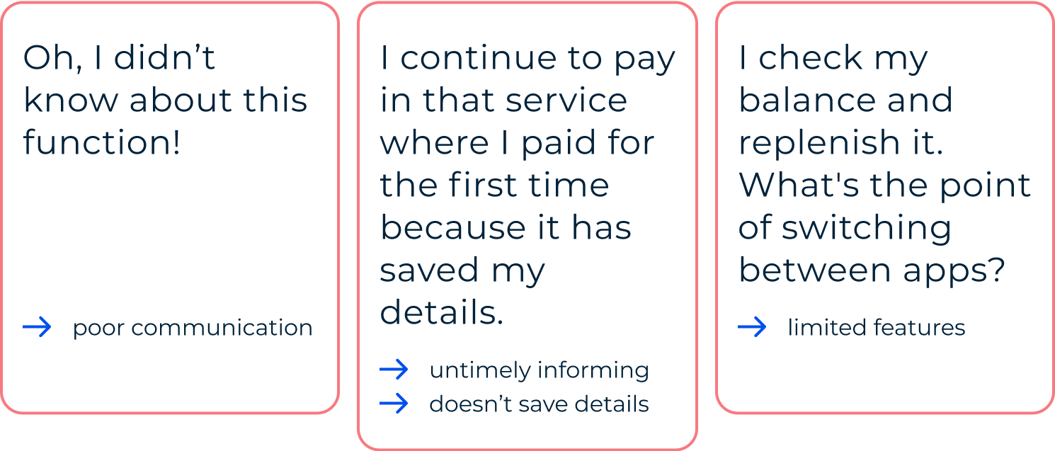
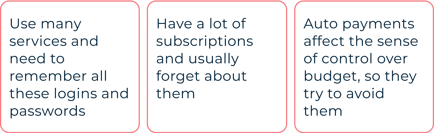
Also, we found out some additional pain points about their work with budget:
Taking into account all these findings, we decided to turn the Payment page into a budget management tool providing insightful information about your incomes and outcomes as well as covering all the core financial tasks.
We created several versions of layouts and mechanics and tested them on the prospective users.
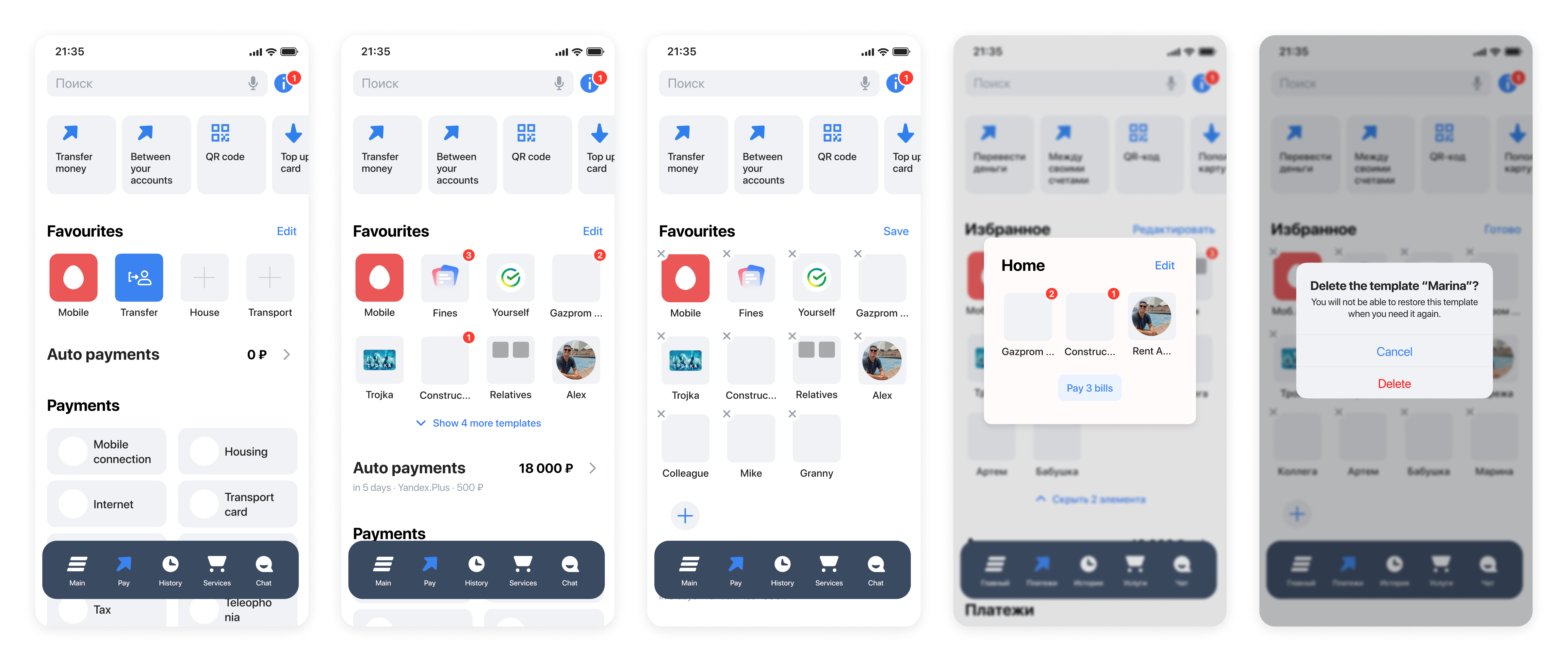
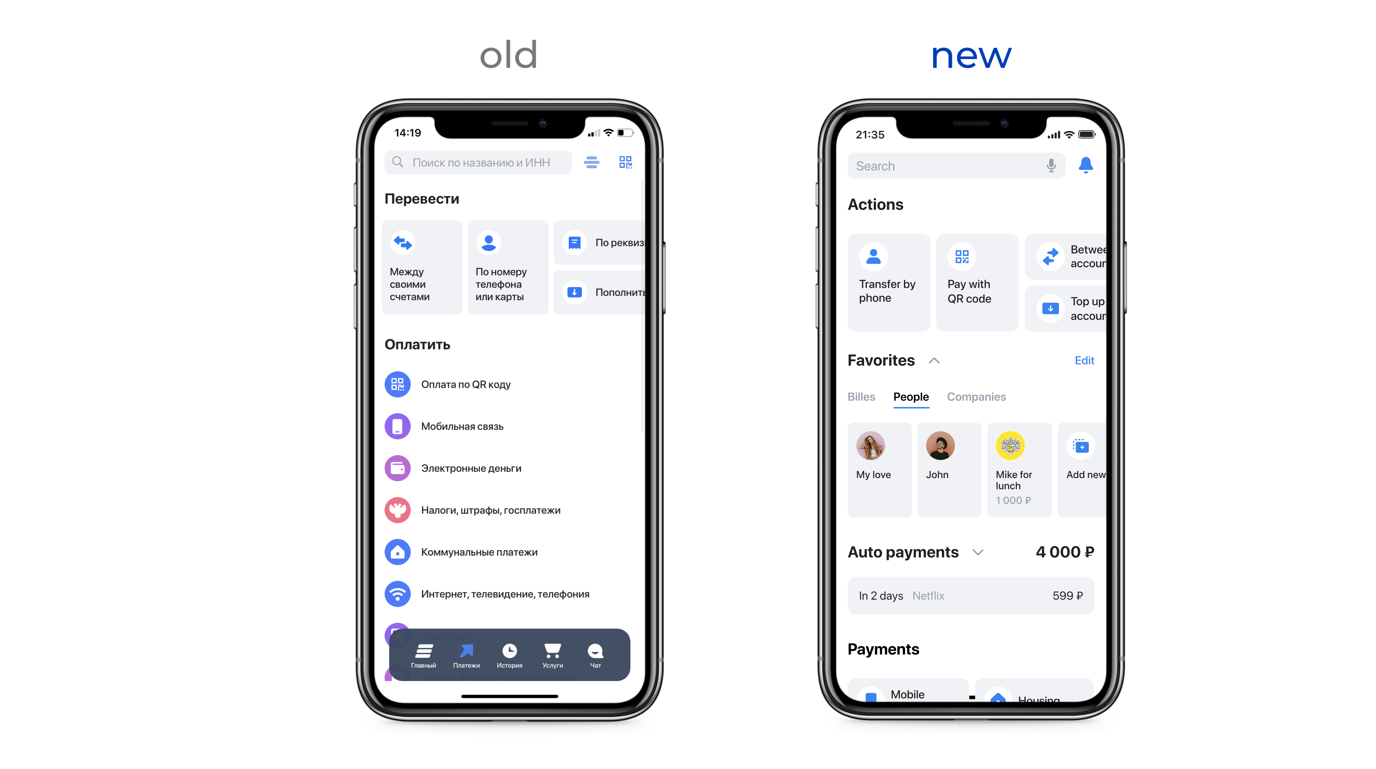
We divided the page into 3 functional zones:

To avoid switching between services, we extend functionality by adding balances, bills details, etc. So every draft on the page becomes more than just a template, but a microservice.
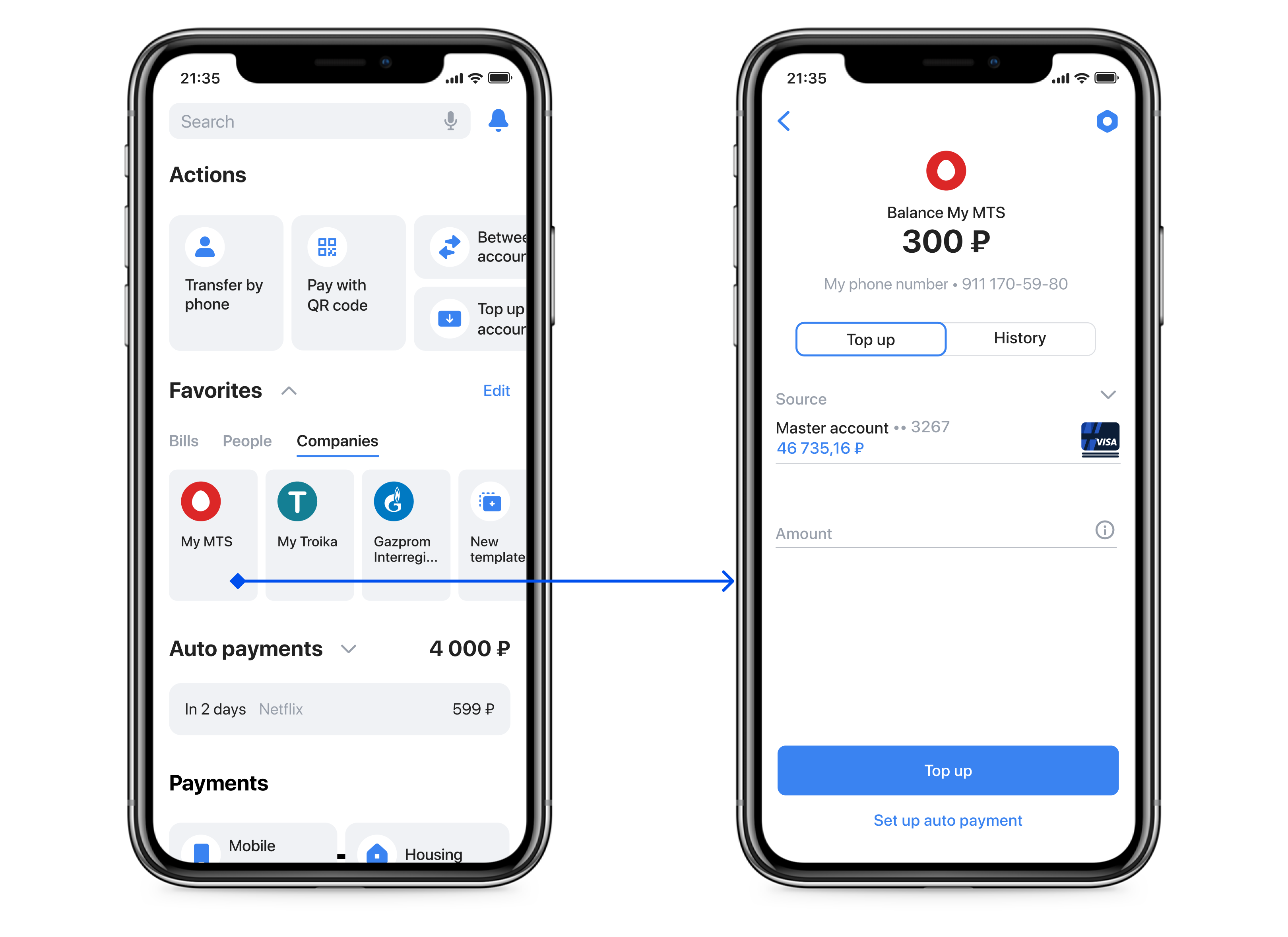
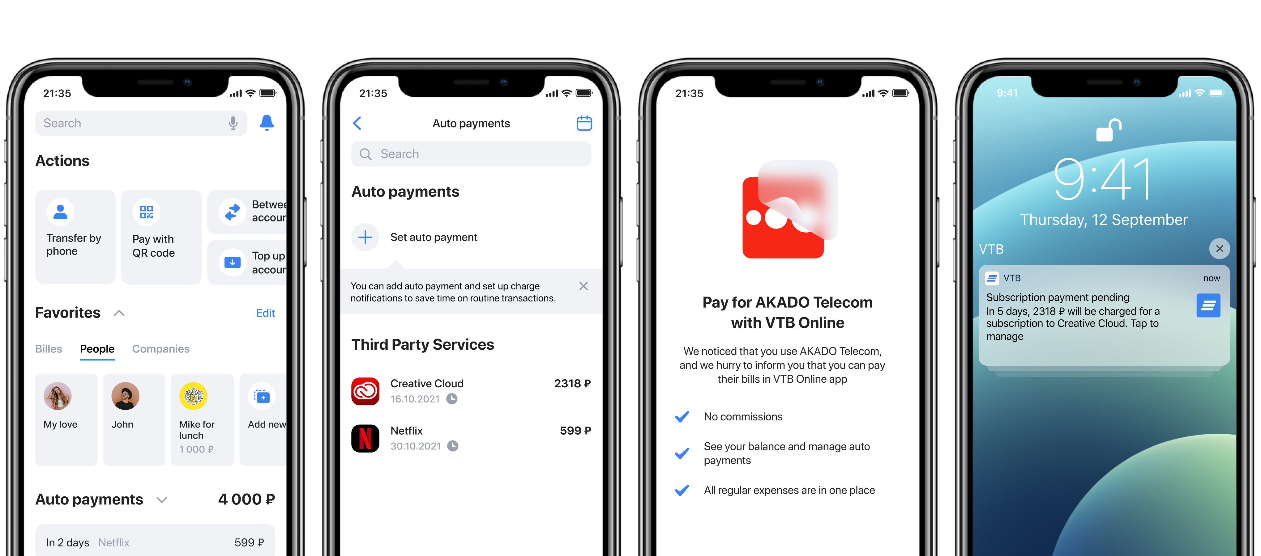
It is challenging to track subscriptions. So we suggest the bank do it for its customers and show them in the new section — Auto payments. Later the service can let managing subscriptions. The monthly total shown in this section can help users plan their budgets.
→ a user will use a VTB bank card for new subscriptions.

We recommend tracking transactions in favor of organizations from the Bank's catalog. If the bank notices such transaction, it can notify a user that these payments can be done using this Mobile Bank, no need to use other services.
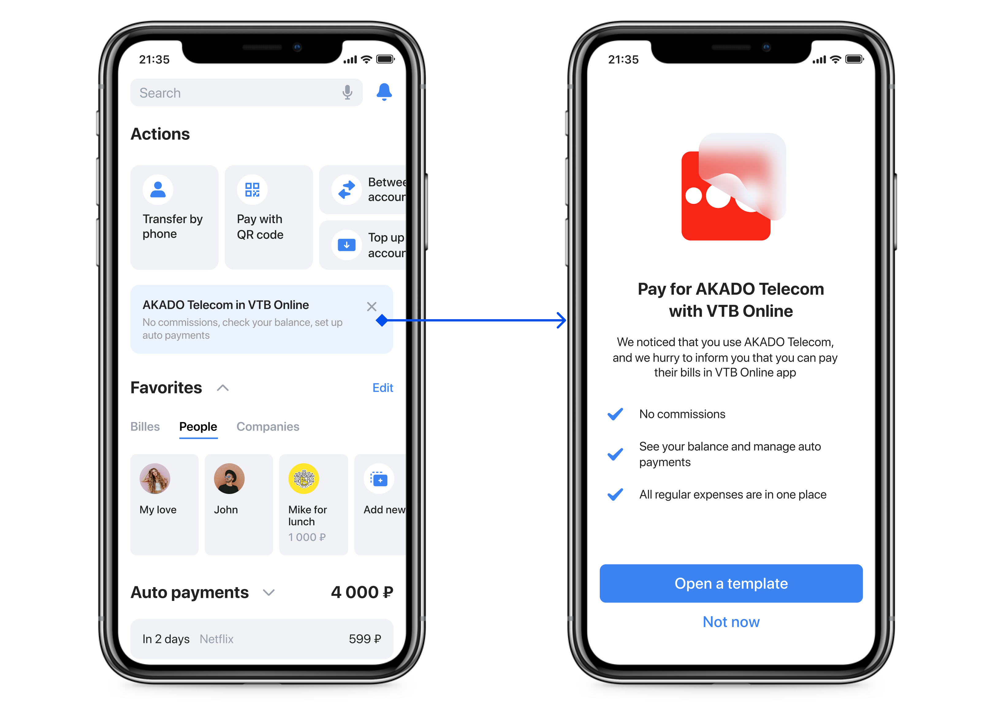
The user may accidentally close the recommendation or may not need it yet. We proposed storing all the recommendations in a separate tab of the Notifications Center so that the user could use them at any time.

The search string is the entry point for many operations. That’s why the search should be improved and:

The concept successfully passed all tests and received approval for development after being presented to management. However, due to the political situation, the mobile app was subsequently blocked from app stores, rendering it impossible to bring the envisioned concept to fruition.