Selectel
How I scaled a legacy infrastructure management interface
Selectel is a leading cloud infrastructure and data center provider. One of its core products — Cloud Servers (Virtual Machines) — was originally designed for small infrastructures but gradually evolved into a critical enterprise-level product without being structurally redesigned.
When a major enterprise client reported severe usability and performance issues while managing 50–100 servers, it became clear that the existing interface no longer scaled — neither technically nor cognitively.
As the sole UX designer, I led the redesign of the servers panel from discovery to release, focusing on improving infrastructure health assessment, speed of interaction, and scalability, while preserving usability for small clients.
For enterprise clients managing large infrastructures:
This resulted in:
At the same time, small clients still relied on the existing mental model — so a full redesign risked alienating them.
Sole UX Designer in an agile team (PO, QA, 2 developers). I owned:
There are two major types of users. The interface was clearly optimized for group #2, while failing group #1.

I started with session replays and heatmaps to quickly understand real user behavior.

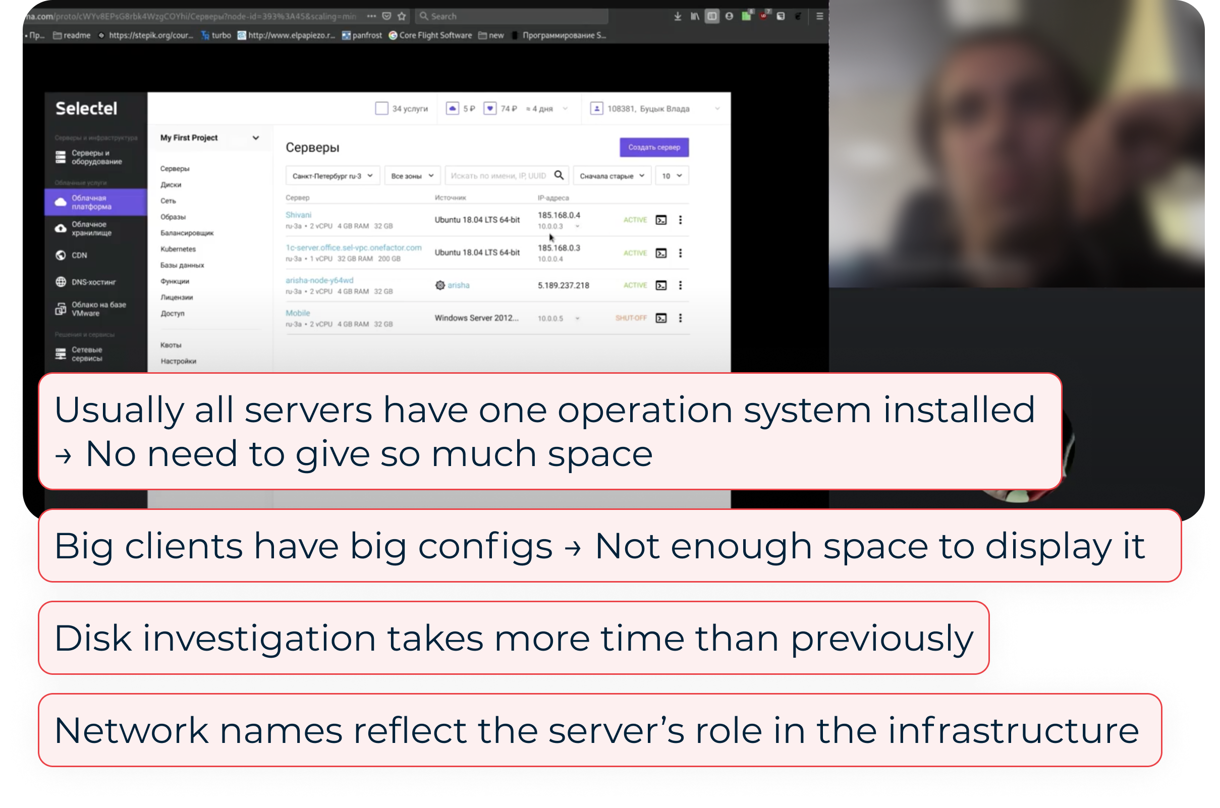
Cloud servers are tightly connected to disks, networks, images, clusters — each owned by different teams.
To understand constraints and opportunities, I conducted interviews with backend & frontend engineers, as well as discussions with support teams (as pain-point carriers). This helped uncover:

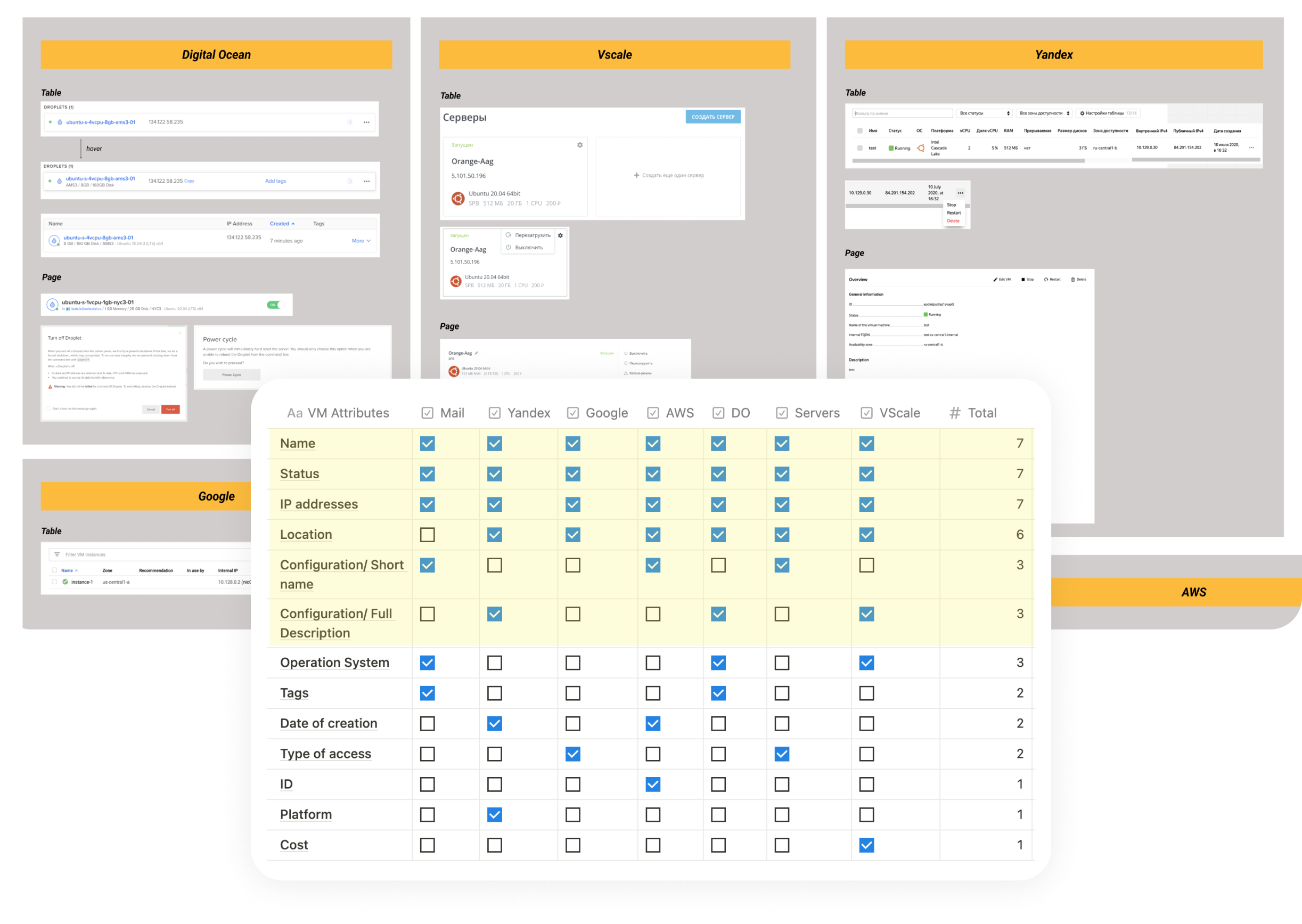
Enterprise clients typically use multiple cloud providers simultaneously to diversify risk. This made competitor analysis especially important:
➞ common patterns reduce switching costs,
➞ familiar interactions increase trust.
I analyzed how competitors handle large server lists, key attributes visibility, bulk actions, health assessment.
I interviewed 5 system administrators managing 10+ servers per location.
As a result, I revealed 5 Key Jobs to Be Done (ranked by importance). During the interviews users also rated task difficulty and time required in the existing UI.
The most critical tasks were the least efficient.

I explored multiple structural approaches: compact layouts, bulk interactions, customizable tables, aggregated health widgets, etc. — and discussed them with my team. Most of the ideas were left behind due to the limited backend scope.
After prioritizing features, we decided to focus the first iteration on changes to the server list. Here, I had to balance the needs of two different user types: enterprise users, who are interested in density and speed, and small users, who value familiarity and simplicity.
I tested early prototypes with internal engineers (as proxy users).
As a result, most tasks became faster, with the exception of one critical one: server recovery took longer due to the boot disk information being buried too deeply. I iterated on the structure and retested until all key tasks improved.
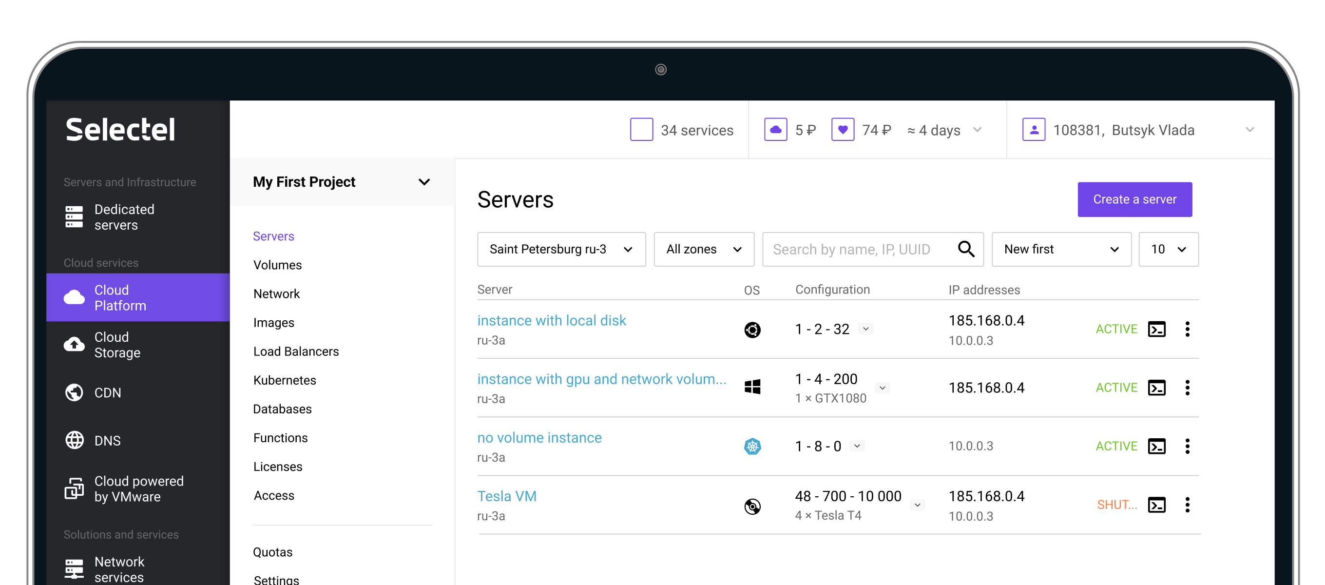
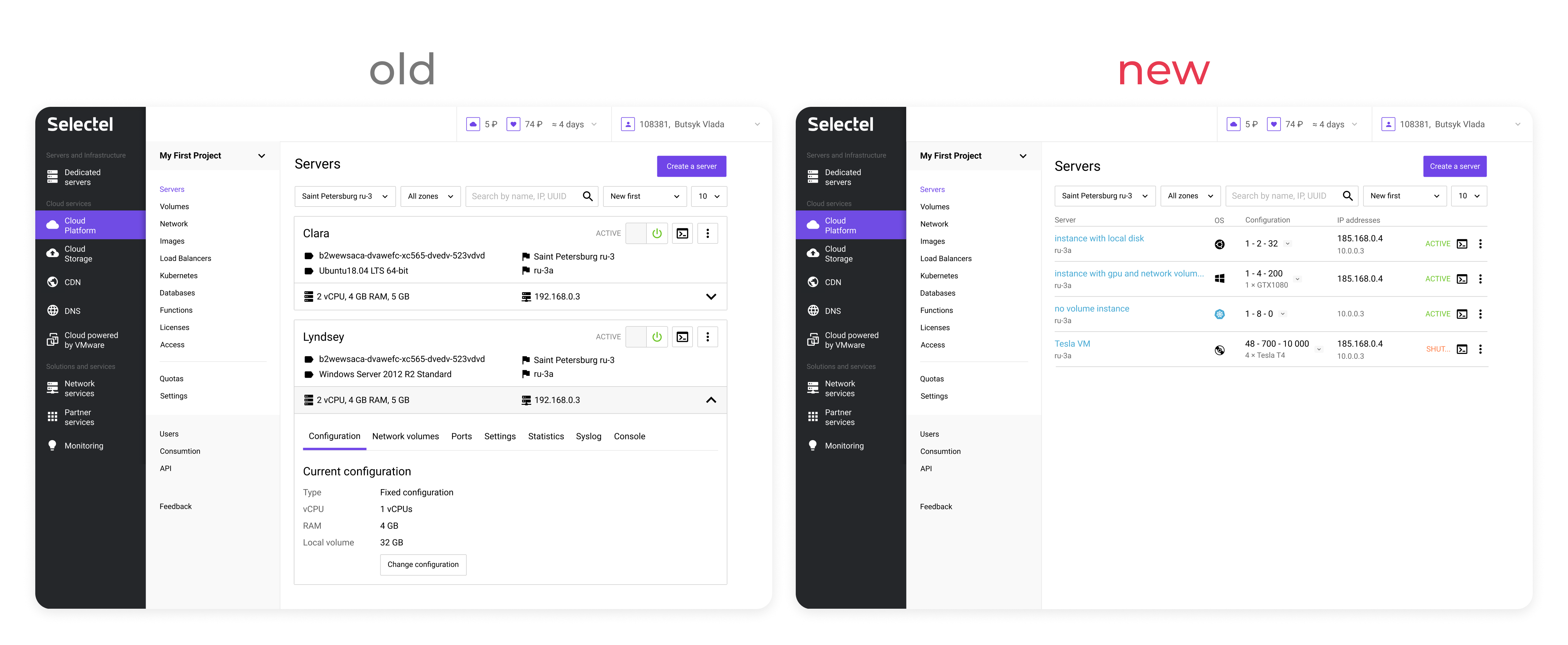
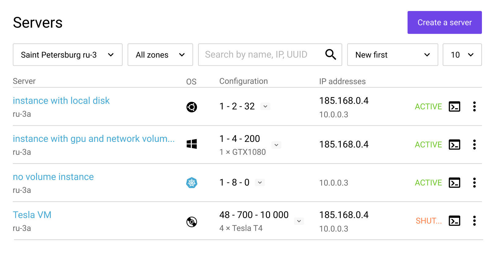
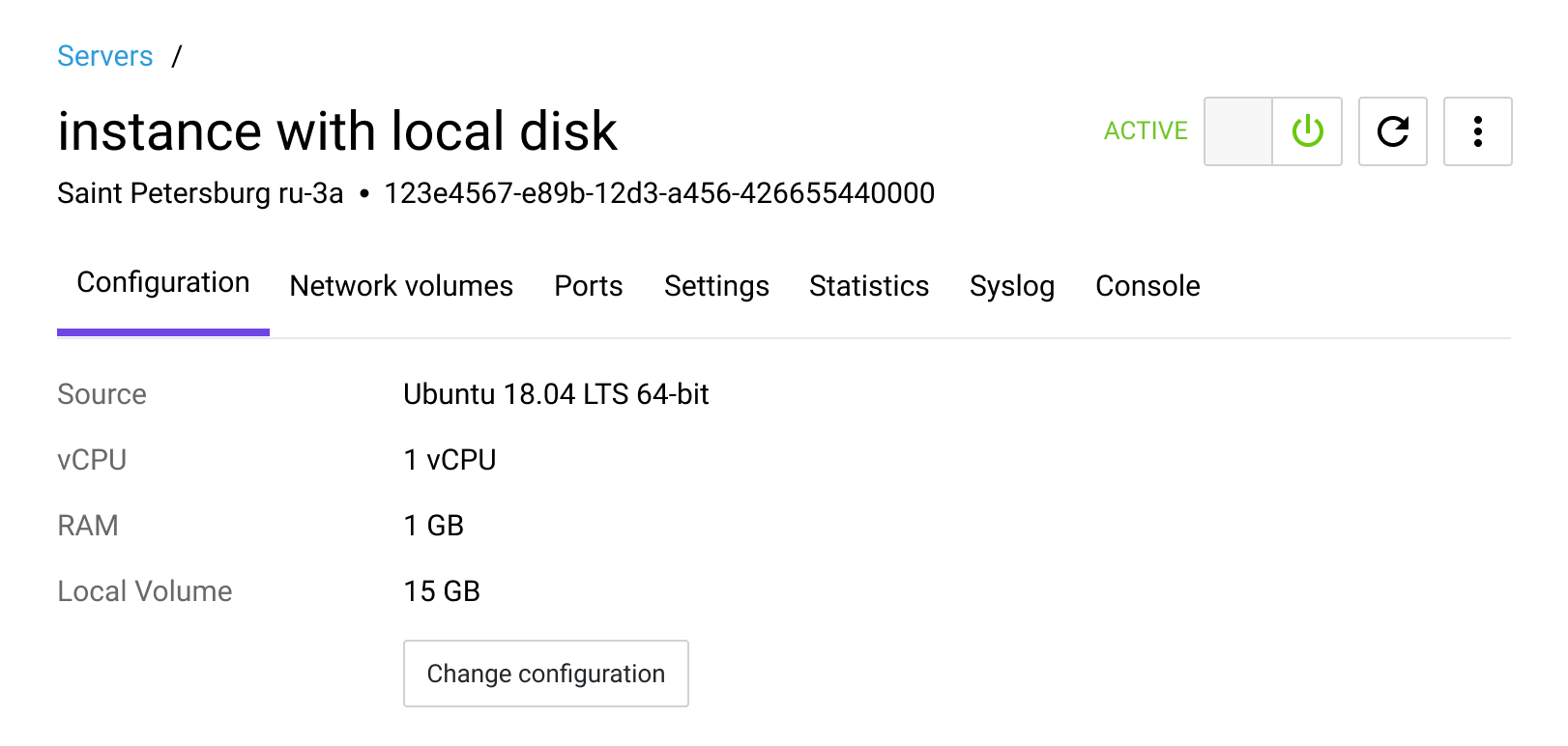
Cards were replaced with a tabular layout, which accelerated infrastructure health assessment and instance searches due to the higher information density. Furthermore, this solution scales more for large infrastructures.
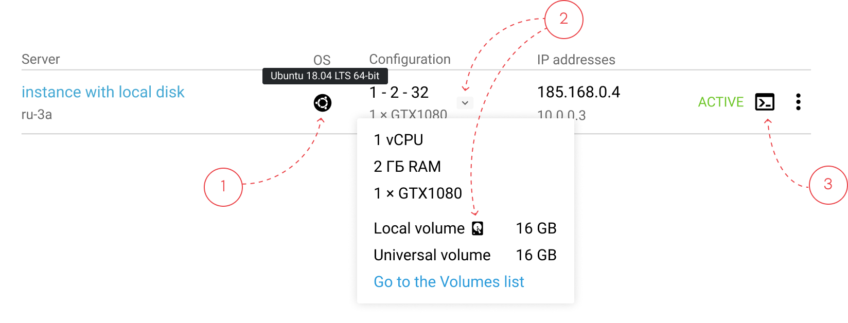
From research, server repair follows a mental checklist: check an operating system (1) and type of a bootable disk (2), and then connect to the server’s console (3). The UI was optimized to support this sequence with minimal navigation.
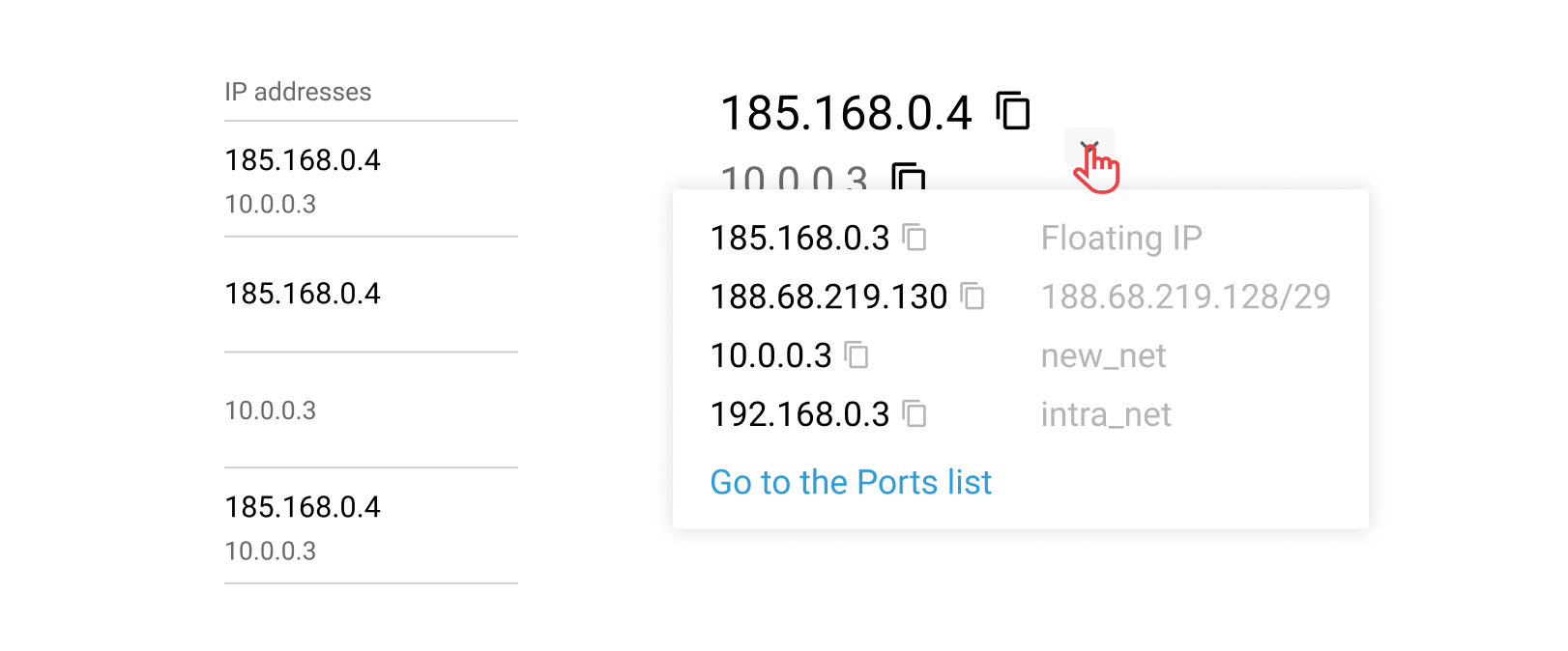
IP address often reflects a server’s role in the infrastructure. So, my teammate and I came up with the unique indication system:
This helped to show addresses in one column and leave it possible to navigate through different types of IPs. Moreover, a public server (the main player in the infrastructure) became more visible.
A separate server page enables working with multiple servers in parallel, which was impossible in the old UI.
To reduce cognitive load and speed delivery, the first version reused the initial card structure with one key change: the console, which was used most often, was moved to the last tab (instead of being located in the middle). Placing it on the first tab would have degraded perceived performance due to the heavy loading time, while the last tab is the most quickly accessible.
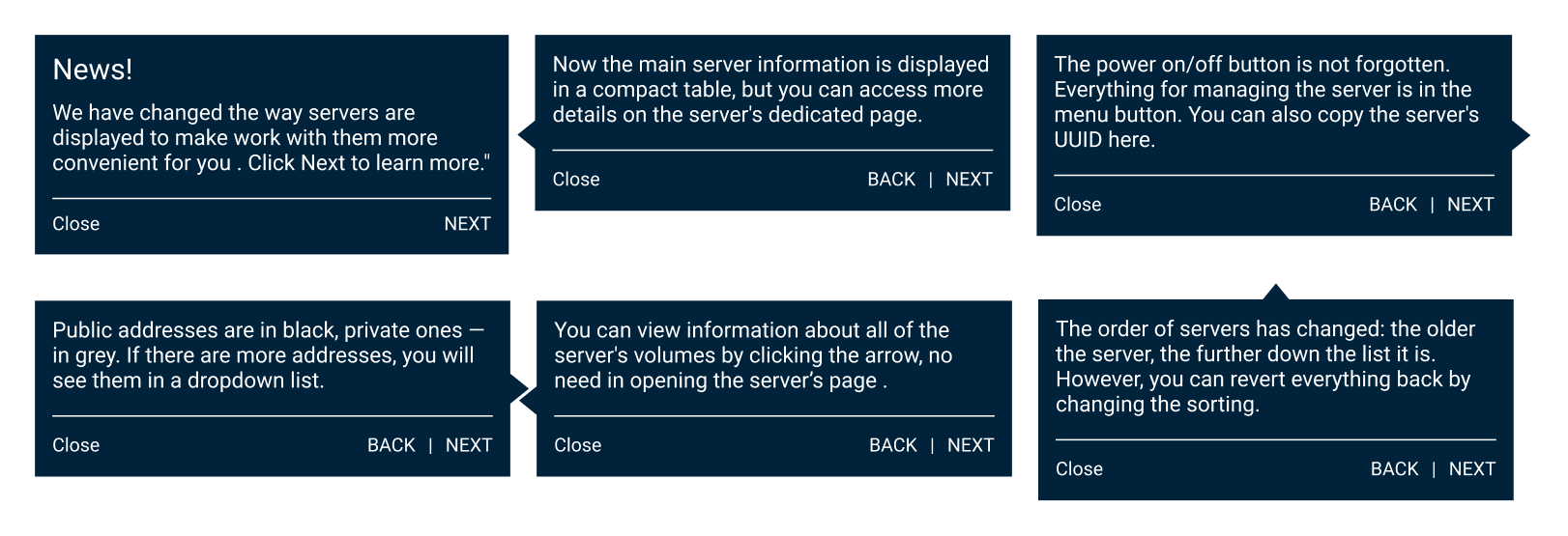
For those who had had servers at the release date, I created a set of tips. They covered only the typical user tasks to not overwhelm a user and pointed to a certain part of the interface to ease acquaintance.
Furthermore, a feedback entry point was added directly in the interface.
Deliverables included:
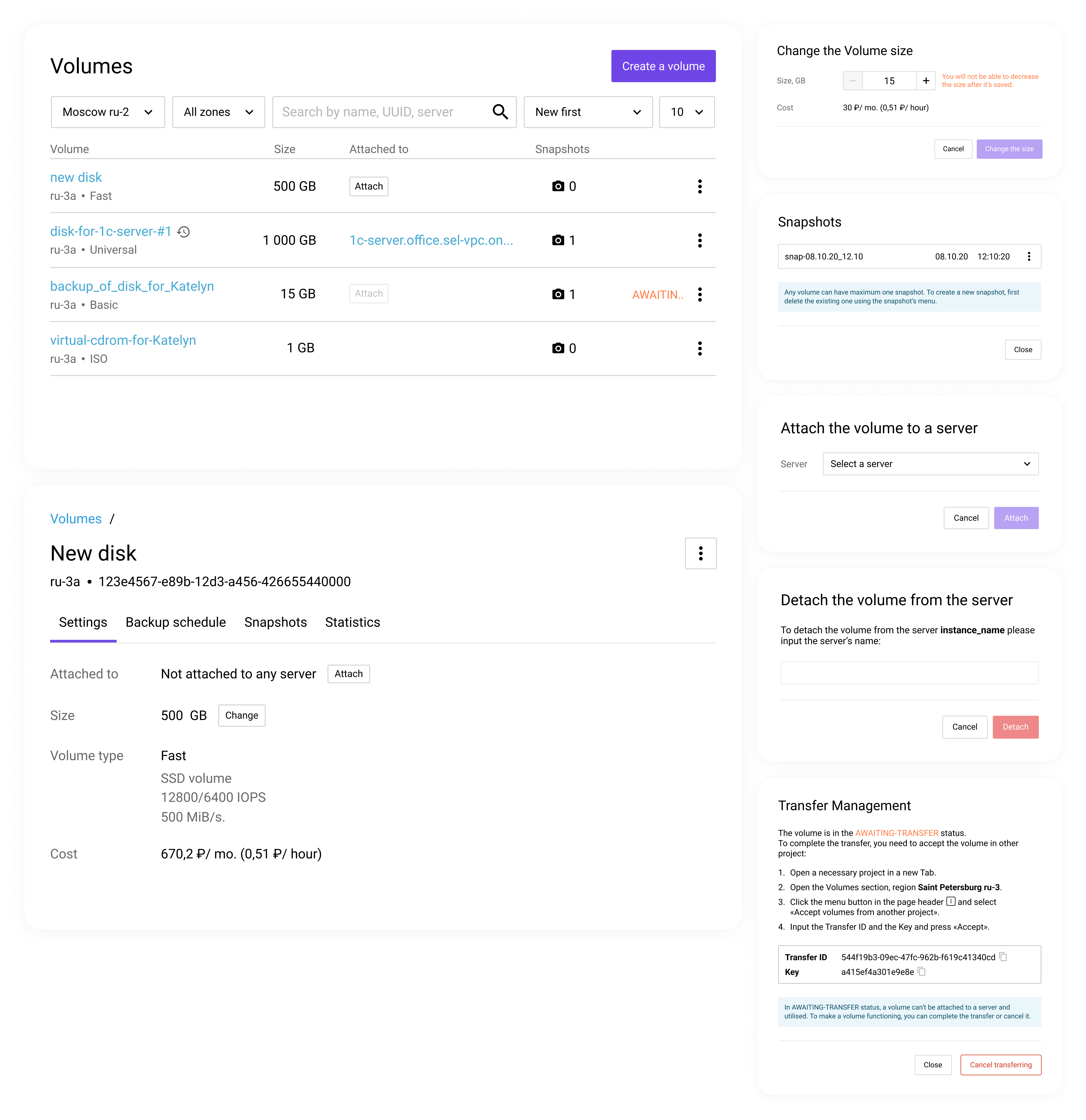
The findings became the foundation for redesigning the Volumes Panel, where I later led a full structural overhaul.
Looking back, I would push harder for an aggregated infrastructure health widget.
Although it required significant backend work, it could have:
Another learning: 5 interviews were enough to uncover major issues but more quantitative validation would strengthen confidence.
Most importantly, shipping quickly allowed us to learn faster from real usage and iterate based on actual behaviour.
This project taught me how to: